Black and white frames are often the default option when it comes to picture framing. They’re neutral, versatile and widely used in galleries, homes and commercial spaces. But safe doesn’t always mean best.
While black and white frames can work beautifully, making them the automatic choice may not always do your artwork justice. The right frame should enhance the piece, support the space it lives in and feel intentional rather than formulaic.
Here’s how to decide whether black or white is truly the right choice for your artwork.
Why are black and white frames so popular?
Black and white frames dominate for a reason. They’re clean, predictable and easy to style.
Black frames:
- Add definition and contrast
- Work well with photography and graphic art
- Suit modern and industrial interiors
White frames:
- Feel light and understated
- Pair well with minimal spaces
- Help colourful artwork feel contained
Both options are widely accepted in gallery settings because they allow artwork to take centre stage without introducing additional colour.
If you’re unsure, black or white will rarely look bad. But that doesn’t mean they’re always the most thoughtful choice.
Does the artwork itself favour black or white?
Start with the artwork, not the room.
Black frames tend to work best when:
- The artwork contains strong dark tones
- The composition has clear contrast
- You want to create a bold, graphic edge
White frames often suit:
- Soft, pastel or airy pieces
- Watercolours and delicate drawings
- Artwork with generous negative space
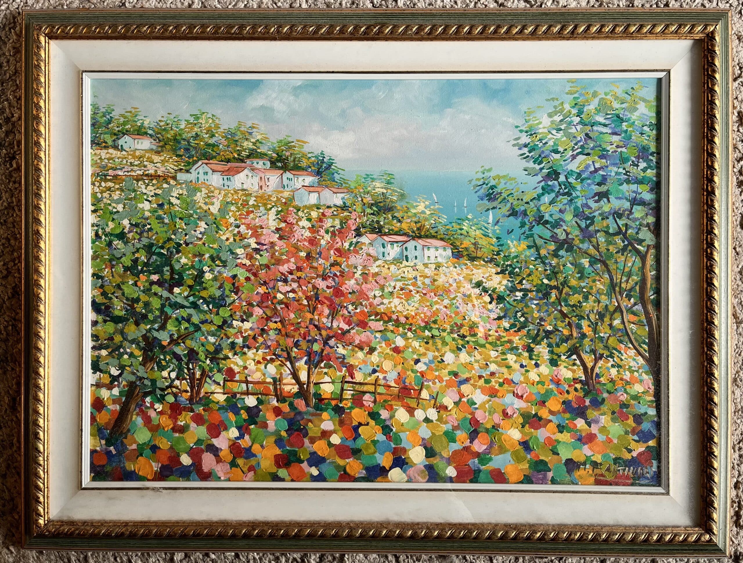
However, problems arise when contrast is too extreme. A heavy black frame around a subtle pencil drawing can overwhelm it. A stark white frame around a richly coloured oil painting may feel disconnected.
The frame should support the mood of the artwork, not compete with it.
How does the interior space influence the choice of picture frame?
While artwork should lead, the surrounding space still matters. In bright, contemporary interiors with white walls, white frames can sometimes disappear. That can be desirable, or it can make the artwork feel lost.
Black frames introduce structure in light spaces, creating definition against pale walls. In darker interiors, though, black frames may blend too much into the background.
Natural wood frames, particularly in oak or ash, often strike a middle ground. They add warmth without overpowering the artwork and tend to sit comfortably in both modern and traditional settings.
Are black and white frames really neutral?
Technically yes, but visually, they behave differently. Black is strong. It creates a boundary, drawing a line around the artwork and says, “Look here.” That’s powerful, but not always subtle.
White is less bold, but it can feel clinical if it’s too bright. Cooler whites can clash with warm-toned artwork, while warmer whites may soften a piece too much.
Even within “black” and “white,” there are variations:
- Matt black vs satin black
- Bright white vs off-white
- Warm white vs cool white
Small tonal differences can make a big impact.
Can frame colour create consistency across multiple pieces?
In galleries, offices or series of artworks, black and white frames are often chosen for consistency. Using one frame colour across multiple works creates cohesion and reduces visual noise.
Monochrome frames can work well here: they allow collections to sit together neatly, especially when artwork varies in colour or subject matter.
If you’re framing multiple pieces, choosing one profile and one colour, whether black, white or natural wood, usually creates a stronger overall result than mixing styles.
When might another frame colour or finish work better?
There are moments when safe choices become predictable. Hand-painted frames in muted tones, such as soft grey, sage or deep blue, can elevate artwork without overwhelming it.
Natural wood finishes can highlight texture and warmth in both contemporary and traditional pieces. The key is restraint. If you move away from black or white, keep the profile simple and the finish matt. The goal is enhancement, not decoration.
The balanced approach
Black and white frames are popular for good reason. They’re versatile, reliable and rarely distracting. But they’re not a universal solution.
The best framing choice depends on:
- The artwork’s colour and mood
- The space it will live in
- Whether it’s a single piece or part of a collection
- The level of contrast you want to create
Sometimes black or white is exactly right. Other times, a natural wood or softly painted frame will elevate the work in a way neutrality simply can’t.
If you’re unsure, comparing a few curated options side by side often makes the decision clear. We’re always happy to provide further advice at our framing shop in East London, or via our website contact page.