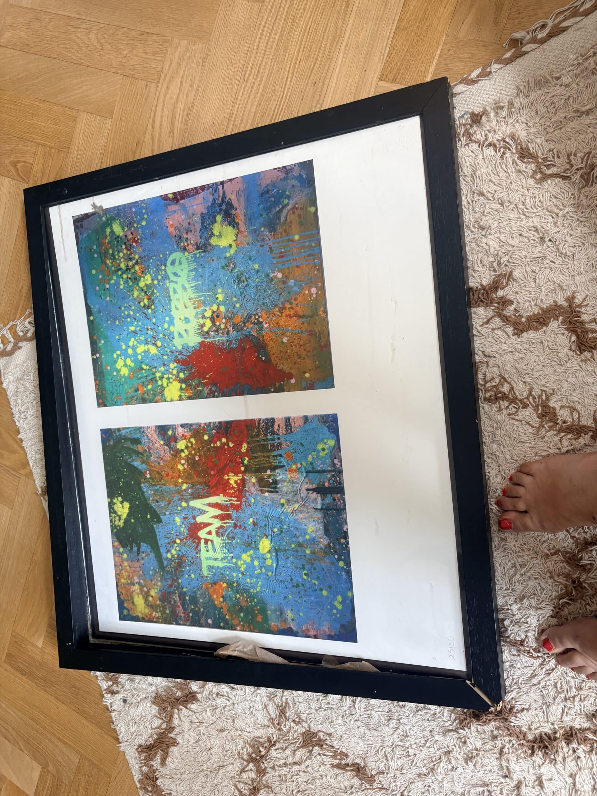
Choosing a frame for an abstract print can feel surprisingly difficult. Unlike traditional landscapes or portraits, abstract art often has no obvious subject to guide your decision.
Instead, the composition, colour, texture and mood of the piece all play a role in determining which frame will complement it best… but that’s not to say there is a single ‘correct’ choice.
A well-chosen frame should enhance the artwork without competing for attention, while also helping it sit naturally within your home or workspace.
Whether you have bought a limited-edition print, discovered an emerging artist or are framing a favourite contemporary piece, the right custom picture frame can completely transform how the artwork is experienced.
Start with the artwork itself
Before thinking about your interior, spend some time looking closely at the print. Abstract artwork is often built around colour, shape, movement and negative space rather than recognisable imagery.
Ask yourself what stands out first. Is it bold and energetic, soft and minimal, heavily textured or dominated by a particular colour palette? A frame should support those qualities rather than distract from them.
For example, a vibrant abstract print filled with strong geometric shapes may benefit from a simple, understated frame that allows the artwork to remain the focal point.
On the other hand, a more delicate abstract piece with muted tones might suit a natural timber frame that adds warmth without overwhelming the composition. The artwork should always lead the decision-making process.
Consider the style of the frame
The profile of the frame can have just as much impact as its colour. Slim frame profiles are particularly popular for contemporary and minimalist interiors because they create a clean finish and allow the artwork to take centre stage. They work especially well with modern abstract prints, photography and graphic artwork.
Wider frames can create more visual presence and are often suited to larger statement pieces. A substantial frame may help anchor oversized artwork within a spacious room, particularly when the print is intended to become a central feature.
Rather than choosing the most decorative option, think about the overall character of the artwork. Abstract prints often benefit from thoughtful simplicity.
Should you choose black, white or wood?
These are three of the most versatile choices when framing abstract artwork.
A black frame creates definition and contrast. It is an excellent option for bold contemporary prints, monochrome artwork and interiors with a modern edge. Black can make colours appear more vivid while giving the artwork a crisp, gallery-inspired appearance.
A white frame tends to feel lighter and more subtle. It works particularly well with colourful abstract prints where you want the artwork to feel bright and airy. White framing can also blend beautifully into minimalist interiors without visually dominating the wall.
Natural wood offers warmth and texture. Oak, ash and other timber finishes complement abstract prints that feature earthy colours, organic shapes or softer palettes.
Wooden frames are also ideal for creating a relaxed, curated interior that feels less formal than an all-black or all-white scheme.
Think about the colours within the print
You do not need to match the frame exactly to one of the colours in the artwork. In fact, choosing a frame that matches a bright accent colour too closely can sometimes make the overall piece feel overly coordinated.
Instead, look for colours that complement the artwork as a whole.
Match the frame to your room, not just your artwork
Although the artwork should come first, the surrounding space still matters. Consider where the finished piece will hang. A bold abstract print above a sofa may benefit from a frame that complements nearby furniture, lighting and finishes.
In a creative home office, a slim aluminium frame might reinforce a contemporary aesthetic, while a living room with natural materials may suit timber framing more naturally.
You do not need every frame in your home to match exactly. Instead, aim for a sense of consistency through materials, tones or overall quality.
This is particularly important if the artwork will become part of a gallery wall alongside photography, illustrations or other prints.
Let the framing enhance the artwork
The best frame for an abstract print is one that makes the artwork feel complete. By considering the colours, composition, frame profile, mounting options and the room where the piece will live, you can create a finish that feels intentional and timeless.
Custom picture framing also gives you the opportunity to explore different materials and styles before committing, ensuring the final result complements both your artwork and your interior.